Minas Coffee Rebrand
Minas Coffee Rebrand
Minas coffee rebrand
Minas Coffee is a local Brisbane cafe and roastery, sourcing beans from their family property and neighbouring farms in Brazil.
This project was part of the Symbols & Branding subject of the Diploma of Graphic Design at Torrens University and required students to select a local business for rebranding.
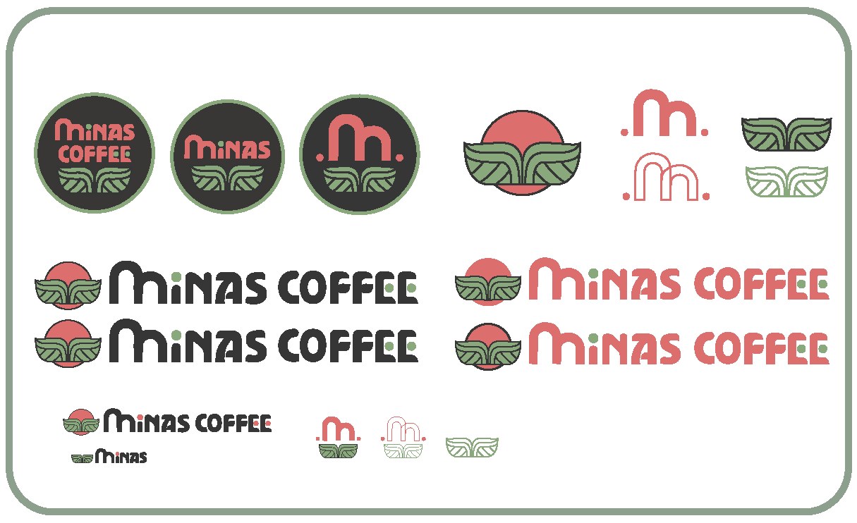
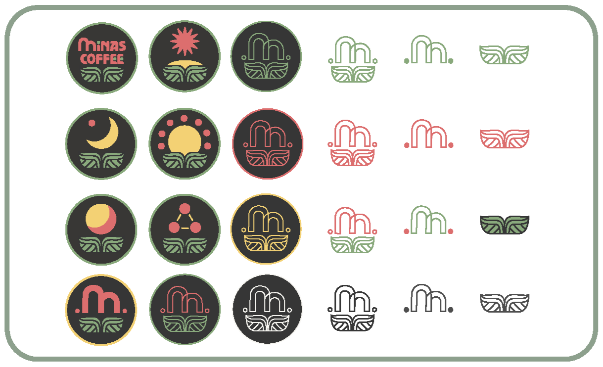
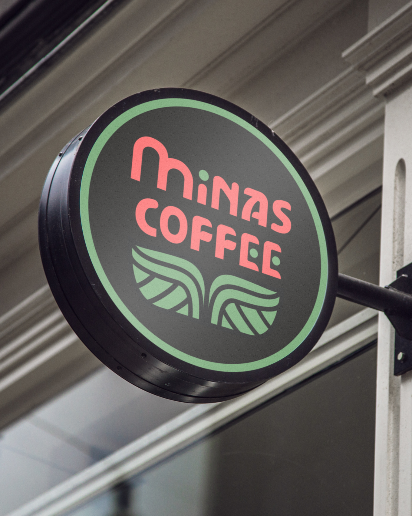
Research into the company's history and the coffee-growing region of Minas Gerais informed the identity, which includes a new logo, submarks, packaging concepts for new blends, and a cohesive colour palette.
The red M represents the mountains of Minas Gerais, one of Brazil's most significant coffee-growing regions and the inspiration behind the company's name. The red and green dots symbolise coffee cherries. The leaf symbol incorporates two pairs of hands: the upper half symbolises support, while the lower half represents presentation. The two leaves also acknowledge the café's co-founders.
*This project was part of the Symbols and Branding subject of the Diploma of Graphic Design at Torrens University, and is not in any way affiliated with Minas Coffee.